The Challenge
Buildland's previous website felt cluttered, text-heavy, and visually overwhelming. It lacked hierarchy and clear messaging, making it difficult to communicate the brand's professionalism and credibility at first glance.
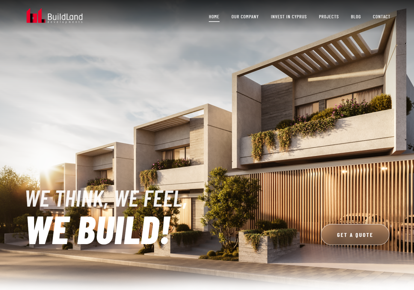
The Approach
This was not a full rebrand, but a strategic redesign focused on clarity, structure, and presentation. I redesigned and developed the homepage and project pages to create a more refined and intuitive user experience.
For the homepage, I introduced a cleaner layout, stronger visual hierarchy, more white space, and shorter, more impactful copy.
For the project pages, I created a flexible template that organizes project information, visuals, and specifications in a more elegant and user-friendly way.
Design Direction
Modern, minimal, and architectural. Clean typography, balanced layouts, and a premium real estate aesthetic designed to feel polished, timeless, and easy to navigate.
The Outcome
A more structured and visually confident website that presents Buildland as a modern and trustworthy real estate developer. The redesign improves clarity, usability, and overall brand perception.